preloader
User Interface
Sign-In page

The Sign-In page offers a clean and secure interface for accessing Jjodel. Users are prompted to enter their Email and Password in designated fields, followed by clicking the Login button to proceed. For new users, a Register link provides direct access to the registration page, while an additional Forgot your password? link aids in account recovery, ensuring easy access even if credentials are misplaced. The Jjodel logo, prominently displayed below the form, serves as a visual anchor. This streamlined interface prioritizes user convenience, facilitating quick access to the platform with minimal distractions.

Registration page

The Account Registration page allows new users to create a Jjodel account by filling out a simple form. Required fields include First Name, Last Name, Nickname, Affiliation, Country, Email, and Password (with a confirmation field to ensure accuracy). Users may also opt to receive Jjodel’s newsletter by selecting the checkbox, which keeps them updated on platform news and developments. Before finalizing the registration, users must agree to the platform’s terms and conditions by proceeding with the Create button. For those who already have an account, a Sign In link is provided at the bottom, redirecting them to the login page.

Password Recovery Page

The Password Recovery page allows users who have forgotten their password to regain access to their account. By entering their registered email address in the provided input field, users can initiate the password retrieval process by clicking the Retrieve button. The page also offers convenient navigation links to return to the Sign In page or proceed to the Register page if the user does not have an existing account. This streamlined interface ensures a quick and secure way to recover account access on the Jjodel platform.

Dashboard

The Dashboard provides users with a central hub to manage their projects within the Jjodel platform. At the top of the interface, users have options to create new Jjodel projects either as Public or Collaborative projects, or to Import an existing Jjodel project. Below these options, a grid layout displays the user’s projects, organized with intuitive cards that display the project name, last edited timestamp, and an empty project indicator.


On the left sidebar, users can navigate between All Projects and Recent Projects, mark projects as Starred for quick access. Additionally, there’s a Support section that includes What’s New, Getting Started, and the User Guide to assist new users or provide additional help.


The Dashboard also includes filters for project visibility (e.g., public, private, collaborative), and sorting options on the right side. A summary panel on the bottom right provides an overview of the user’s total project count and the number of artifacts developed, enhancing the user’s experience by giving quick insights into their work on the platform.

Opening a New Project

This screen displays the initial view when opening a newly created project in Jjodel. The Summary section provides a high-level overview, including the project name, creation date, and creator information. Here, users can see that the project has no associated metamodels or models yet; it only contains default viewpoints, indicated in the Viewpoints section.

On the left sidebar, project-related actions are available, including options to Download, Add to Favorites, or Close Project. Additionally, the Support section provides quick access to What’s New, Getting Started, and the User Guide.

The Legend at the bottom helps users understand the different icons representing Metamodels, Models, Viewpoints, and Overlay Viewpoints. On the right side, a project information card summarizes the project’s current state, indicating that it’s a basic setup with no added content. This screen serves as a starting point for users to begin structuring their project by adding metamodels, models, and customizing viewpoints.

Metamodel Editor

The Metamodel Editor in Jjodel provides a visual interface for defining metamodels, which act as the structural blueprint for models created within the tool. In this example, the editor showcases the structure of a simplified UML class diagram metamodel, featuring key elements and their relationships.


  1. Main Canvas (Center): The main area displays the hierarchical and relational structure of the metamodel elements. Here, we see abstract and concrete classes that make up a UML class diagram, including Type, Feature, Class, Attribute, and Operation. Relationships between these classes define the inheritance and associations among metamodel components. For instance, Type is an abstract superclass, with PrimitiveType as one of its subclasses and specific data types like Int, String, and Boolean derived from it.
  2. Properties Panel (Right): This panel enables users to view and edit details about the selected metamodel. For example, the properties panel here shows information for the current metamodel with the name UML_Class_Diagram_v3.1 and provides an option to mark it as read-only.
  3. Features Panel (Left): The Features panel provides options to add various elements to the metamodel, such as Package, Class, and Enumerator. Users can drag and drop these features onto the canvas to build out the metamodel structure.


The Metamodel Editor is integral to creating a structured framework for models by specifying entities, attributes, relationships, and visibility options. This allows users to define the constraints and capabilities of models built upon this metamodel, ensuring consistency and adherence to the intended structure and semantics of the modeling domain.

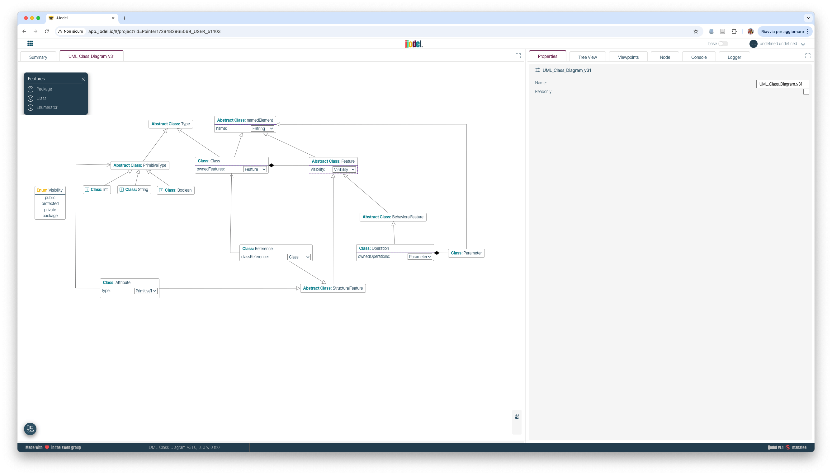
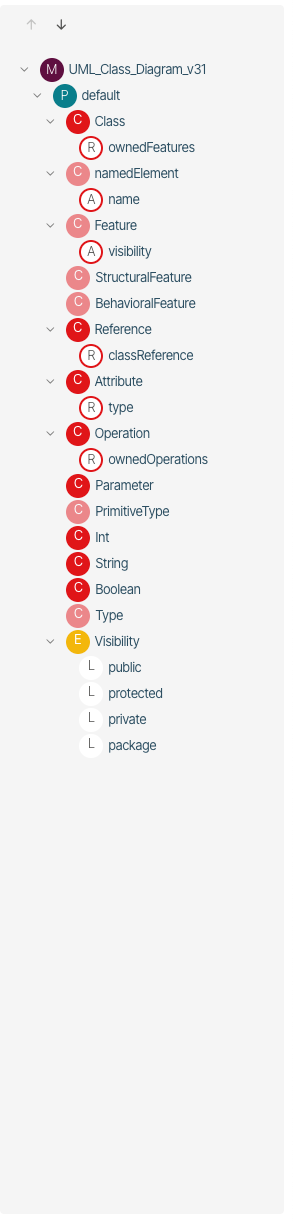
Tree-View Panel (Metamodel)

The Tree View panel provides a hierarchical structure for navigating and inspecting elements within both the metamodel and model editors in Jjodel. This structure is organized to reflect the nested relationships and features of elements, allowing users to explore the components of a project efficiently.

In the figure on the right, the Tree View represents the UML class diagram metamodel presented above. The main elements within this view include:


  1. Root Node (UML_Class_Diagram_v31): This is the primary node representing the UML class diagram metamodel. It serves as the parent node containing all other entities within this model structure.
  2. Packages and Classes: Under the main metamodel node, individual classes such as Class, Feature, Reference, and Operation are displayed. These represent the foundational elements defined in the metamodel, with each class containing its own properties and sub-elements.
  3. Attributes and Properties: Elements like ownedFeatures and ownedOperations are organized as sub-nodes under their respective classes, such as Class and Operation. Attributes like name, visibility, and type provide additional details on each class or feature, enabling users to understand specific properties and relationships at a glance.
  4. Primitive and Enum Types: The Tree View includes entries for primitive types (Int, String, Boolean) and enumerations such as Visibility, with values like public, protected, private, and package listed as leaf nodes. These types define the data and accessibility constraints within the metamodel.
  5. Hierarchical Organization: Each element is presented in a structured, expandable tree format, allowing users to drill down into specific features or collapse nodes for a cleaner view.

The Tree View in the metamodel editor acts as a blueprint, showing the framework for constructing models and guiding users in navigating the structural composition and inheritance of elements within their project. This view aids in understanding the high-level organization of the metamodel, while each node and sub-node offers quick access to inspect individual properties and relationships.

In the following prompt, the Tree View structure for a model instance will illustrate how this hierarchy extends to specific instances based on this metamodel.

Tree-View Panel (Model)
 

When the model editor is selected, the Tree View panel provides a structured overview of instantiated elements based on the underlying metamodel, presenting each instance and its attributes in an organized hierarchy. The figure on the right shows the Tree View for UML_CD_Instance_1, illustrating how objects instantiated from the metamodel are represented.

1. Root Node (UML_CD_Instance_1): This is the main entry point for the model instance and serves as the parent node for all instantiated elements, representing a specific instance of the UML class diagram.
2. Primitive Types and Data Types: Instances of primitive types such as Int, String, and Boolean are displayed as foundational types that attributes and other elements reference.
3. Class Instances: Under the root, class instances like User and Role are expanded to show their attributes and features. Each class instance corresponds to an object in the model, reflecting the class structure defined in the metamodel.
4. Attributes and Properties: Each class instance, such as User or Role, includes nodes for attributes like name, id, surname, and role. These attributes are represented with their names and, in some cases, further properties (e.g., type, visibility). The visibility of each attribute is indicated by nested properties under each attribute node.
5. Hierarchical Structure: Attributes that belong to classes, like ownedFeatures under User and Role, are organized in a hierarchical format, facilitating exploration. This structure allows users to see the relationships and compositions within each instance and easily access the detailed properties of each element.
6. Class References: For attributes that reference other classes, such as the role attribute in User, the classReference property is shown, which specifies the linked class. This makes it clear how instances are interconnected in the model.

The Tree View in the model editor enables users to drill down into each model element’s attributes and inspect values, visibility settings, and interconnections between objects. This view mirrors the structure from the metamodel, but at the instance level, providing insight into how abstract definitions translate into concrete model instances.

Viewpoints Panel

The Viewpoint Panel provides a structured view of the different viewpoints within the Jjodel environment, allowing users to organize and customize how model elements are visualized and validated based on specific viewpoints. Each Viewpoint (VP) groups together the views characterizing a specific aspect. 


The Viewpoint Panel is essential for managing multiple perspectives on a model, allowing users to toggle between different viewpoints and customize the appearance and behavior of model elements according to each viewpoint.


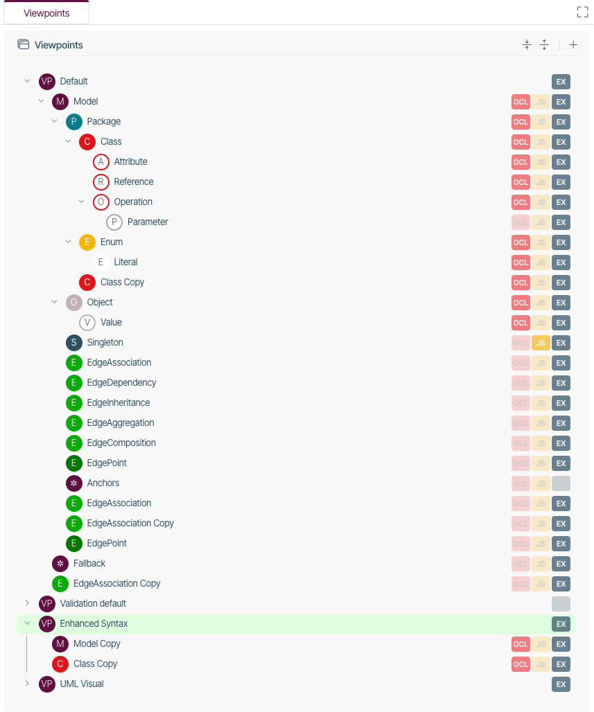
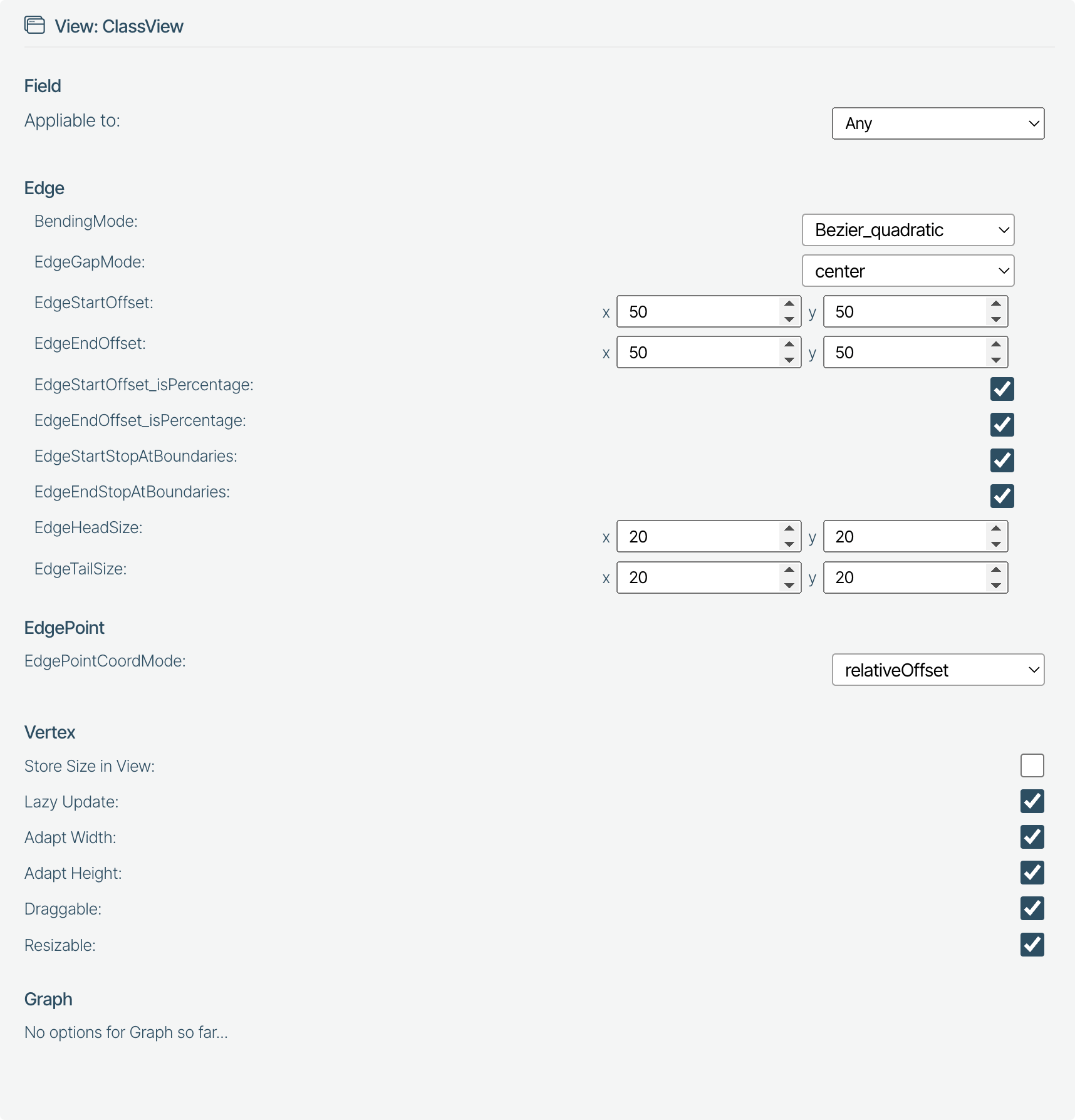
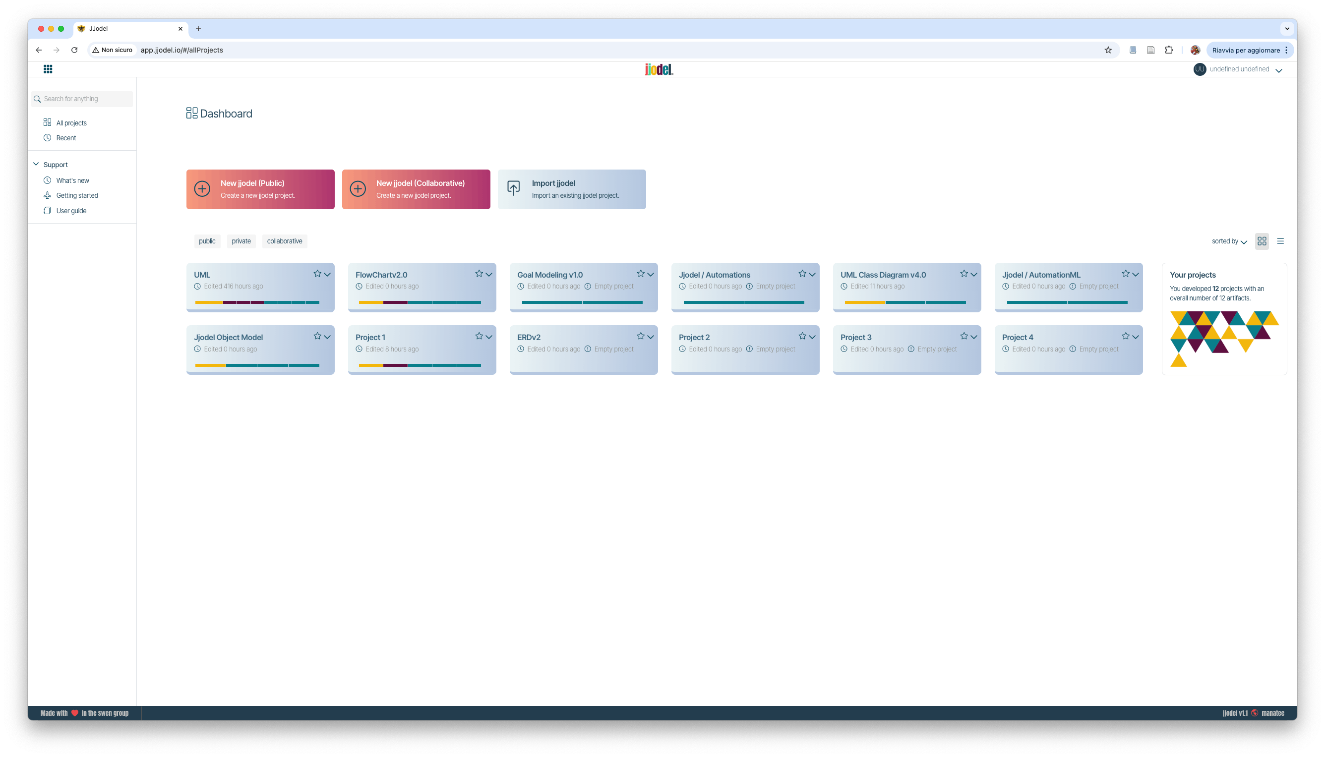
A Viewpoint consists of a number of views. Each view is organized in a number of panels as follows


Such panels define all the characteristics of a view.
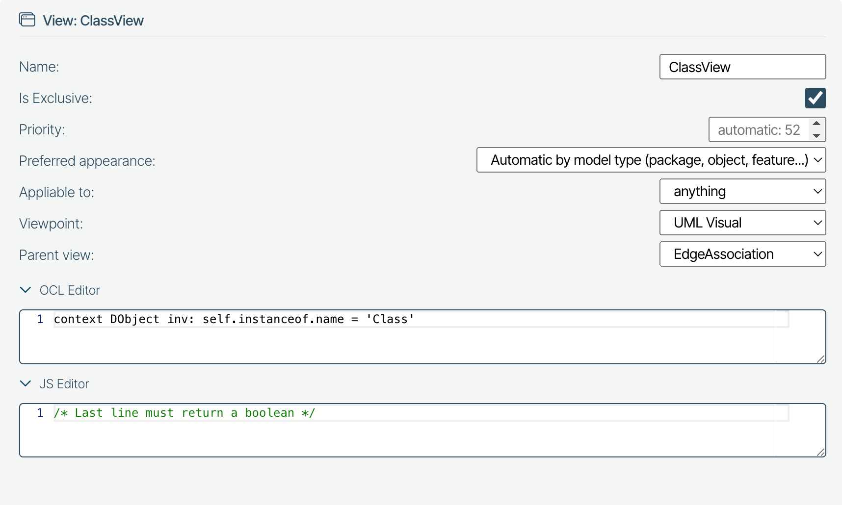
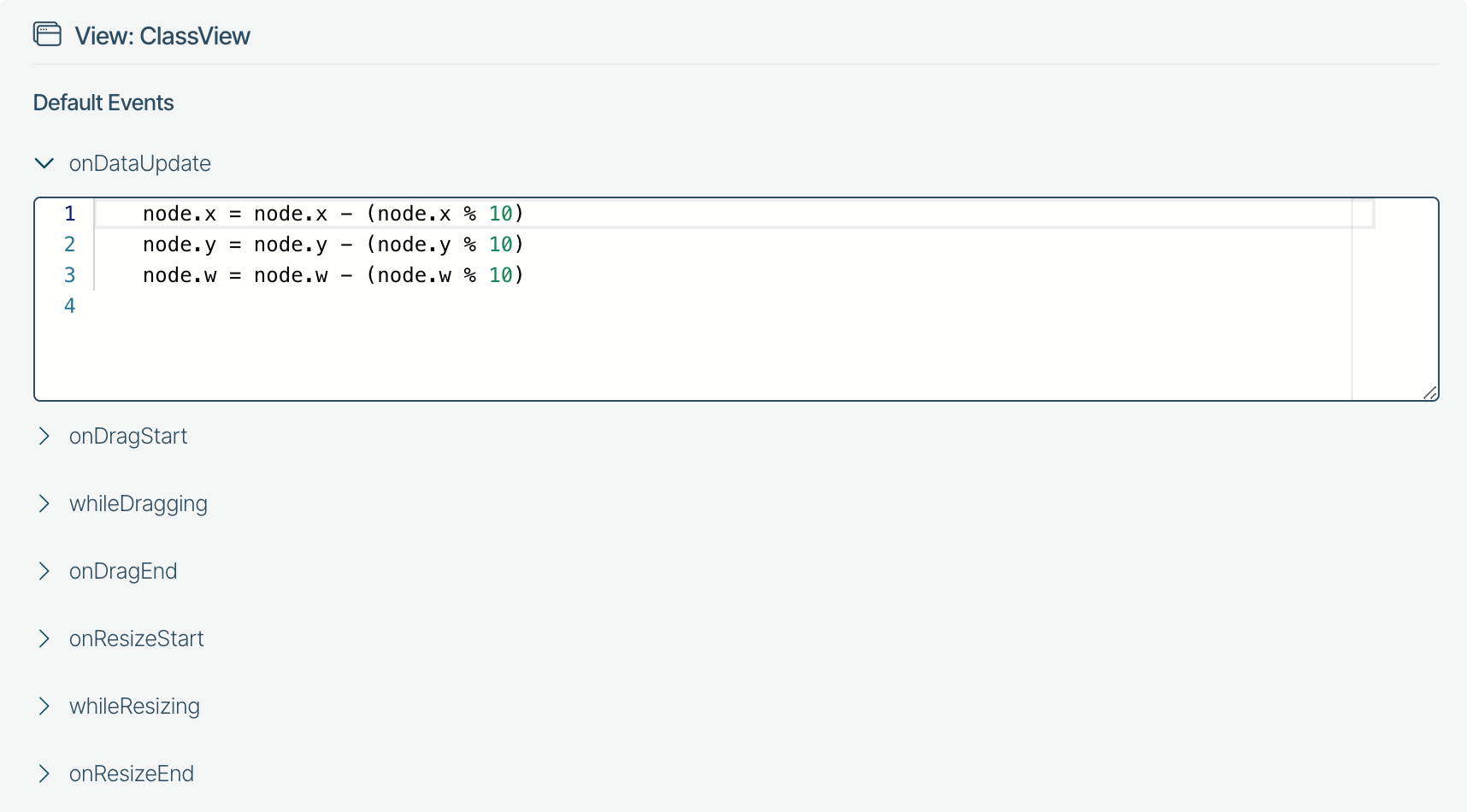
 
Applied to 

The Applied To section in Jjodel allows users to configure the application of views or templates to specific model elements. The first section of the panel exposes the following attributes

  • – Name: Defines the name of the view, in this case, ClassView, indicating that the view will be applied to elements identified as classes.
  • – Is Exclusive: A checkbox indicating whether this view is exclusive. When checked, it prevents other non-exclusive views from being applied to the same element, ensuring that ClassView has priority for specified model elements.
  • – Priority: Sets the priority level for applying the view. Higher priority values make this view more likely to be applied when multiple applicable views are available.
  • – Preferred Appearance: Determines how the view appears based on model types like packages, objects, and features. The example shows an automatic appearance based on the model type.
  • – Applicable To: Specifies the elements to which this view applies, with “anything” indicating it can apply to various types within the model.
  • – Viewpoint: Selects the viewpoint to associate with this view. Here, it is linked to the UML Visual viewpoint.
  • – Parent View: Defines a parent view, if any, to inherit properties. In this case, it’s linked to EdgeAssociation, suggesting hierarchical structuring among views.
Next the OCL editor allows for Object Constraint Language (OCL) expressions to define constraints on when the view applies. The example predicate:
 
				
					context DObject inv: self.instanceof.name = 'Class'


specifies that this view applies only to instances where the object is of type Class.


The JS Editor allows for an alternative way of expressing the predicate selecting the instances to be rendered. In this case, the predicate is a JavaScript expression to define more dynamic application logic. The JavaScript expression should evaluate to true or false, determining if the view applies.


Template

The Template Section for the ClassView defines the JSX structure and layout for the visual representation of the instances of the Class instances in Jjodel. Here are the components:


  1. JSX Editor: The JSX Editor contains the JSX template that renders the instances of the reference metaclass, Class in this case.
  2. Constants: These are values evaluated once and used to set specific parameters or conditions.
  3. Listed Dependencies: These fields define reactive dependencies, i.e., observed properties that trigger the instance rendering whenever the undergo a change in value.

This template defines a flexible and modular visualization for ClassView, utilizing JSX for the structure and reactive dependencies to keep the view dynamic and responsive to changes in data and layout.


Style
 

The Style Section for the ClassView allows you to customize the appearance of the ClassView component using CSS and LESS syntax. This section provides an interface to set styling properties such as colors, fonts, borders, and spacing.


At the top of this section, additional configuration options are listed. New parameters can be defined by means of the following widget 

that permits to add 

  • Palette: a set of user-defined colors as follows
  • Number: a measure in px or any other units allowed in CSS
  • Text: a string
  • Path: an SVG path to be used in combination with the CSS
This panel gives users a quick and flexible way to control the visual aspects of the ClassView component, making it easy to adapt to different themes or branding requirements.
 
Events

This panel displays configurable event handlers that respond to various interactions within the ClassView component. These handlers allow for custom behavior during updates, dragging, and resizing of nodes in the interface. The panel includes both default and custom events.

Each expandable section represents a specific event type, which includes:

  • onDataUpdate: This event executes whenever the data associated with a node updates. In this case, the provided code snippet aligns node positions (x, y, and w) to a grid by adjusting the node’s coordinates:
				
					node.x = node.x - (node.x % 10);
node.y = node.y - (node.y % 10);
node.w = node.w - (node.w % 10);


This code ensures that node coordinates snap to the nearest multiple of 10, providing a clean alignment.

  • onDragStart, whileDragging, onDragEnd: These events are triggered at different stages of a dragging interaction. They allow for defining behaviors such as snapping, visual feedback, or constraint handling during node movement.
  • onResizeStart, whileResizing, onResizeEnd: These events are similar to the drag events but focus on resizing interactions. They can be used to enforce minimum or maximum size limits, update layout parameters, or add visual cues.
Options

This Options panel allows for configuring properties related to edges, vertices, and edge points within the ClassView display. It defines the behavior and appearance of connectors (edges) and nodes (vertices) in the diagram. The different options are described below:

  • – Field
    • – Applicable to: Specifies the model elements this view can be applied to, with “Any” indicating general applicability.
  • – Edge
    • – BendingMode: Controls the shape of the edge; here, set to Bezier_quadratic, creating a smooth, curved edge.
    • – EdgeGapMode: Defines how gaps are handled between edges and nodes. In this configuration, it is set to center.
    • – EdgeStartOffset and EdgeEndOffset: Define the distance from the start and end points of the edge to the connected nodes. Both x and y offsets are set to 50 units, creating a buffer space between the edge and the nodes.
    • – EdgeStartOffset_isPercentage and EdgeEndOffset_isPercentage: These checkboxes, when enabled, indicate that the offset values are in percentages of the edge length rather than fixed units.
    • – EdgeStartStopAtBoundaries and EdgeEndStopAtBoundaries: When checked, these options ensure that edges start and stop exactly at the node boundaries, rather than overlapping or extending beyond.
    • – EdgeHeadSize and EdgeTailSize: Set the dimensions (width and height) of the edge’s head (arrow) and tail. Here, both are configured as 20 x 20 units.
  • – EdgePoint
    • – EdgePointCoordMode: Defines the coordinate mode for edge points. In this case, it’s set to relativeOffset, meaning edge points are positioned relative to the offset from the connected nodes.
  • – Vertex
    • – Store Size in View: This setting, if enabled, would save the vertex size in the view settings, but it is unchecked here.
    • – Lazy Update: When checked, updates to the view are deferred until necessary, enhancing performance.
    • – Adapt Width and Adapt Height: These options allow the vertex dimensions to automatically adjust to fit content. Both are enabled.
    • Draggable: Enables dragging of vertices, allowing repositioning within the view.
    • Resizable: Allows resizing of vertices in the view, enabling flexibility in layout adjustments.
  • – Graph
    • – Graph options: This section shows “No options for Graph so far…,” indicating that no specific graph-related configurations have been set for this view.

This Options panel provides fine-grained control over the layout, positioning, and behavior of edges and vertices within ClassView, allowing for a highly customizable diagram presentation.

  •  
Node Panel

The Node Panel in Jjodel provides controls for fine-tuning the layout of elements within the visual modeling space. This interface allows users to adjust visual parameters, such as zoom, offset, and the arrangement of sub-elements within the graph. The detailed information is contextual as depends on the model elements that is selected in the metamodel or model editor. 

In the figure below, it is represented the Node Panel when the model is selected (e.g., by clicking on the editor canvas) and includes the following layout information

  1. Zoom Control: X and Y Zoom Levels: These dropdowns allow users to scale the entire graph display along the x-axis and y-axis independently, which is useful for fitting the model within the view or examining details up close.
  2. Offset Control: X and Y Offsets: These fields let users modify the position of the entire graph by setting precise offsets. This feature helps in repositioning the model within the canvas for better visibility.
  3. Width (w) and Height (h): The width and height dimensions allow users to control the visible area, providing flexibility in adjusting the viewable layout size.
  4. Sub-elements: DVertex and DEdge: The sub-elements section lists the nodes and edges in the current model layout.
  5. Node State: This JSON structure provides metadata for the node layout, offering details like:
    • – Level: Indicates the hierarchical depth or level of the node.
    • – Grid: Specifies grid alignment or positioning settings if any.
    • – Level_w, Level_h: Define the layout’s width and height at different hierarchy levels, contributing to the layout’s arrangement and readability.
Console Panel

The Console Panel in Jjodel provides a versatile interface for querying and inspecting elements within the current model. This panel allows users to interact with the model programmatically, retrieving detailed data in response to commands or expressions entered in the console. It consists of the input area, the result section that displays the output of the executed command (in the picture below, the result reveals detailed metadata about the UML class diagram model (UML_Class_Diagram_v31) in JSON format, providing attributes such as:

  • className: Shows the type of object, here labeled as DModel, indicating it’s a model object.
  • id: A unique identifier for the model instance.
  • name: The name of the model, UML_Class_Diagram_v31.
  • isMetamodel: Boolean value indicating if the model serves as a metamodel, set to true here.
  • packages: Contains references to packages within the model.
  • instances: Lists instances related to this model with unique identifiers.

It contains also contextual data, arrays and attributes, such as objects, models, and annotations to specify various properties and elements associated with the model structure. 


The console is extremely useful for testing and debugging navigational and query expressions in View templates as it is interactive and contextual.


For more information about the attributes and properties characterizing metamodel, model, and viewpoint representations you can refer to the Jjodel Object Model reference page.

  •